

Your web browser is out of date. Update your browser for more security, speed, and the best experience on this site.
You may also visit the site on your mobile device.
Without a doubt, any change to a familiar technology process can be difficult. That's especially true if you are a UKG Ready customer still getting used to your new system interface.
After nearly a year of gathering feedback and making usability improvements, UKG recently rolled out the latest Ready UI changes and ended access to its classic UI. And while surveys reflect high customer approval of the changes, a quick glance at the chat board indicates some customers are still struggling to adapt.
According to Improv Application Consultant and UKG Ready expert Rebecca Williams, the change has been bittersweet for some users.
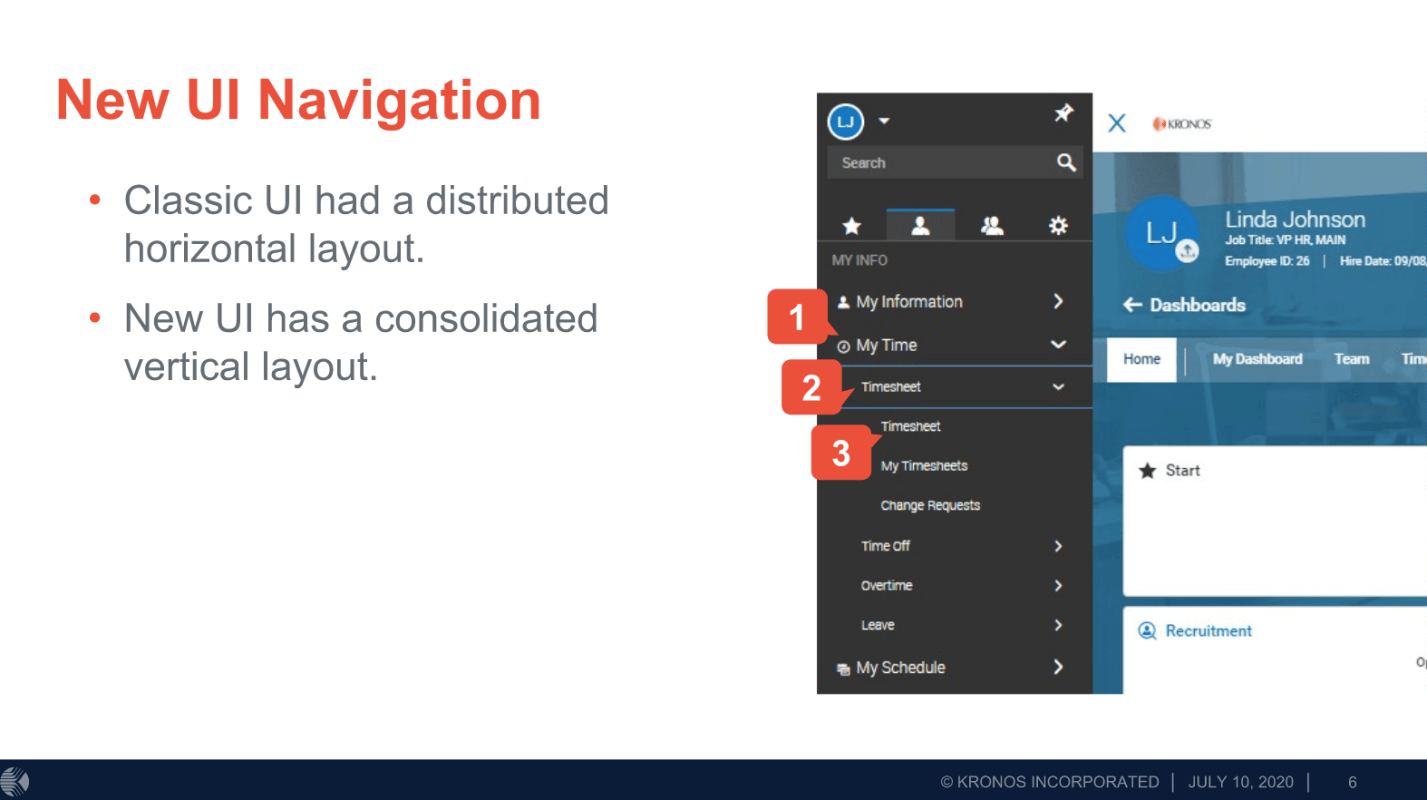
“One of the biggest complaints users had with Classic interface was there was too much horizontal scrolling required. That’s been remedied with an easier ‘jump to' menu,” says Williams. “However, it's still taking people a while to find where things are. This will get easier over time, of course, but for now, the new UI is proving to be a true adjustment for some clients."
 New UI features
While there's a lot more usability built into Ready's new interface, here are a few of the main changes.
Single-column/multi-column toggle: A permanent toggle allows managers to choose between the new multi-column and the traditional single-column view. The single-column view will be within the workspace framework, so users can expand and collapse the “jump to” function on the profiles panel.
Adjustable widget sizes: The ability to adjust widget size capability currently seen on the new UI Dashboard to the multi-column view of the employee profile. This allows users to adjust the height and width of their widgets to customize to their own layout.
Compact view: New fonts, paddings, and field sizes have changed across the entire profile—including widgets. These changes apply to both the multi-column and single-column views.
Vertical layout. All menu items are now in a vertical layout. The Ready classic layout had a horizontal layout.
The toggle (previous or next button) when viewing pay statements is no longer available. Users must be in the Edit mode to toggle.
When in the View mode for Timesheets with multiple employees selected, the Raw Totals and Calc Totals don't refresh when toggling from one employee to another. Instead, the first employee’s total continues to display.
Too much data/information is grouped, which is confusing some users.
Some clients say the pages are too cluttered, harder to read, and several tasks require extra clicks to perform.
According to managers, employees using the new UI are having trouble adjusting to Timesheets in particular. In addition, PTO time isn’t easily visible and easily confused with labor level information.
It now takes extra steps to change or remove a schedule. If someone changes shifts - the area to make the change to the pay calc is now buried, and more steps to get to.
Interface changes aren't always fun but in the long run, they can help you wield more efficiency. According to a May UKG blog post, the company will continue to conduct in-product surveys to improve the customer’s UI experience.
Stop suffering through system bottlenecks and a WFM system that’s not configured to fit your unique workforce. Call Improv today, and let’s start setting new efficiency goals for your UKG system, be it WFR, WFC, or UKG Dimensions!
Download your free UKG Ready Optimization Guide below.


Comments